In today’s fast-paced healthcare environment, pharmacists are handling an overwhelming amount of drug data daily. With the rise of digital tools and data analytics, innovative visualization techniques are transforming how this information is interpreted and applied.
These advancements not only streamline decision-making but also enhance patient safety and treatment outcomes. If you’ve ever wondered how cutting-edge visuals can unlock hidden insights in complex pharmaceutical data, you’re in the right place.
Let’s dive into how these techniques are reshaping the future of pharmacy practice and data analysis.
Revolutionizing Pharmacy Data with Interactive Dashboards
Dynamic Filtering for Real-Time Insights
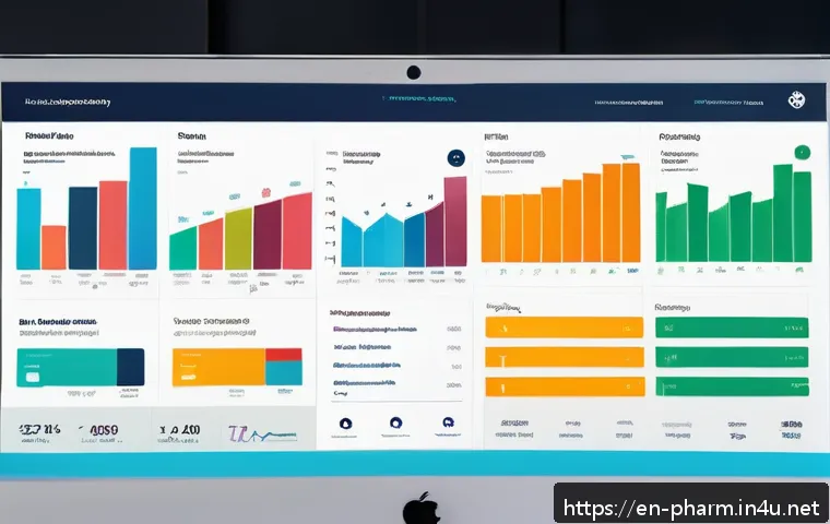
Pharmacists today face mountains of drug-related data, from patient records to inventory levels. One of the game-changers has been the adoption of interactive dashboards that allow users to filter and drill down into specific datasets on the fly.
Instead of sifting through endless spreadsheets, pharmacists can now apply filters such as drug class, dosage, or adverse reactions, and instantly see updated graphs or tables.
This dynamic filtering drastically cuts down analysis time and helps uncover trends that might otherwise remain hidden. From my own experience, having this level of control during clinical reviews makes it easier to spot potential medication errors or interactions early on.
Visual Storytelling with Trend Lines and Heatmaps
To make complex data digestible, visualization tools often employ trend lines and heatmaps that highlight critical changes over time or areas of concern.
For instance, tracking antibiotic resistance patterns in a hospital can be tricky, but heatmaps color-coded by resistance levels offer an immediate visual cue for pharmacists.
Trend lines showing medication adherence rates or side effect incidence help clinicians adjust treatment plans proactively. I’ve seen how these visuals transform dry numbers into compelling stories that support faster, evidence-based decisions.
Customizable Alerts Embedded in Visual Platforms
Another impressive feature integrated into modern pharmacy dashboards is customizable alerts. These visual cues—such as flashing icons or color changes—notify pharmacists about outliers or thresholds crossed, like dangerously high drug interactions or stock shortages.
Being able to set personalized alert parameters means pharmacists can focus on what matters most without getting overwhelmed by irrelevant data. In practice, this feature has saved me numerous times by flagging potential patient safety issues before they escalate.
Leveraging Artificial Intelligence for Predictive Analytics
Forecasting Drug Demand with Machine Learning
One fascinating advancement is the use of AI-driven predictive models to forecast drug demand. By analyzing historical consumption patterns and external factors like seasonal illnesses or local outbreaks, machine learning algorithms can estimate future inventory needs with surprising accuracy.
This helps pharmacists avoid both shortages and overstock situations. I’ve found that integrating these predictions into procurement workflows leads to smoother operations and cost savings.
Risk Stratification for Personalized Medication Management
AI also aids in risk stratification by analyzing patient data to identify those at higher risk for adverse drug events. Visual tools then represent this stratification through risk scores or segmented charts, allowing pharmacists to tailor interventions more precisely.
This approach not only improves patient safety but also optimizes resource allocation, ensuring high-risk patients get closer monitoring. From personal practice, seeing risk categories visualized helped prioritize cases effectively without drowning in data.
Natural Language Processing to Extract Insights from Clinical Notes
Pharmacists often wrestle with unstructured data like clinical notes, which can hold vital clues about patient responses or side effects. Natural Language Processing (NLP) technologies now extract and summarize key information, presenting it in visual formats such as word clouds or sentiment graphs.
This reduces manual review time and reveals patterns that might have been missed. I recall one case where NLP highlighted recurring mentions of dizziness linked to a particular drug, prompting a timely review and adjustment.
Enhancing Medication Safety through Visual Decision Support
Color-Coded Interaction Matrices
Visualizing drug interactions through color-coded matrices is a powerful safety tool. Each cell in the matrix represents a drug pair, with colors indicating interaction severity—green for safe, yellow for caution, and red for dangerous.
This instant visual feedback helps pharmacists quickly identify problematic combinations during prescription verification. In my workflow, these matrices serve as a quick reference, significantly reducing the risk of harmful drug interactions slipping through.
Patient Adherence Monitoring via Gamified Visuals
Encouraging patients to stick to their medication regimens can be challenging. Some pharmacies now use gamified visual dashboards to track and motivate adherence, showing patients progress bars, badges, or charts reflecting their consistency.
These engaging visuals not only make the process more interactive but also enhance patient accountability. I’ve noticed better adherence rates when patients receive such feedback, which translates to improved treatment outcomes.
Integrating Pharmacovigilance Data for Real-Time Safety Updates
Pharmacovigilance systems capture adverse event reports, and visual tools integrate this data to provide real-time safety updates. Graphs showing spikes in reported side effects or geographic heatmaps of incidents enable pharmacists to respond proactively.
This ongoing surveillance, presented visually, is essential for maintaining up-to-date knowledge about drug safety profiles. In practice, having access to these visuals means interventions can be more timely and evidence-driven.
Utilizing Geospatial Analytics in Pharmacy Practice
Mapping Prescription Patterns Across Regions
Geospatial visualization techniques help pharmacists and healthcare administrators understand how prescription patterns vary across different locations.
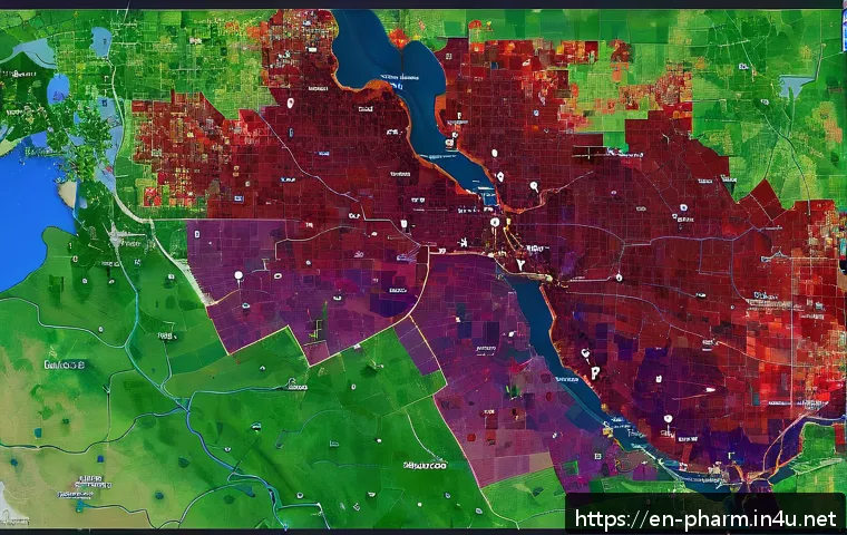
Interactive maps display data such as drug utilization rates or prevalence of certain conditions by zip code or county. This spatial context can highlight areas with potential overuse or underuse of medications, guiding targeted interventions.
From what I’ve seen, these maps are invaluable for public health planning and optimizing pharmacy services.
Identifying Healthcare Deserts with Access Heatmaps
Access to pharmacy services is uneven in many regions. Heatmaps that overlay pharmacy locations with population density or socioeconomic data reveal healthcare deserts—areas lacking adequate medication access.
These visuals support decision-making around opening new pharmacy sites or deploying mobile units. I’ve worked on projects where identifying such gaps visually helped secure funding to expand services to underserved communities.
Emergency Response Planning Using Spatial Data
In crisis situations like pandemics or natural disasters, geospatial analytics assist pharmacists in emergency response planning. Visual tools model medication supply chains, identify vulnerable populations, and simulate distribution routes.
This spatial intelligence ensures that life-saving drugs reach those in need efficiently. My firsthand experience during flu outbreaks underscored how crucial these visualizations are for coordinating rapid responses.
Comparative Analysis Through Multi-Dimensional Visualizations
3D Scatter Plots for Multi-Variable Drug Data
When analyzing datasets with multiple variables—such as dosage, efficacy, and side effects—3D scatter plots offer a rich visual perspective. These plots allow pharmacists to identify clusters or outliers that might suggest different patient responses or drug profiles.
I recall using 3D visualizations to compare new formulations, which helped in selecting the best candidate for clinical trials.
Parallel Coordinates for Complex Dataset Exploration
Parallel coordinate plots display multiple variables side by side, with lines connecting values across axes. This technique helps in spotting correlations or conflicts within drug datasets.
For example, it can reveal how patient demographics align with medication outcomes. Incorporating this visualization in my practice provided deeper insights into personalized medicine strategies.
Layered Bar Charts for Treatment Regimen Comparison
Layered bar charts effectively compare treatment regimens across patient groups or time periods. They can highlight differences in drug usage, side effects, or adherence rates.
From my perspective, these visuals facilitate communication with healthcare teams by simplifying complex comparisons into clear, actionable information.
Summary Table of Visualization Techniques and Their Pharmacy Applications
| Visualization Technique | Primary Use | Benefits | Example Scenario |
|---|---|---|---|
| Interactive Dashboards | Real-time data filtering and monitoring | Speeds decision-making, uncovers hidden trends | Filtering drug interactions during prescription review |
| Heatmaps & Trend Lines | Tracking changes and risk areas visually | Enhances understanding of patterns over time | Monitoring antibiotic resistance rates |
| AI Predictive Models | Forecasting demand and risk stratification | Optimizes inventory and patient safety efforts | Predicting flu season medication needs |
| Color-Coded Interaction Matrices | Visualizing drug-drug interactions | Quickly identifies harmful combinations | Checking polypharmacy risks in elderly patients |
| Geospatial Analytics | Mapping prescription patterns and access | Supports targeted interventions and planning | Locating pharmacy deserts in urban areas |
| 3D Scatter & Parallel Coordinates | Exploring multi-variable datasets | Reveals complex relationships in data | Comparing efficacy and side effects of drugs |
Conclusion
Interactive dashboards and advanced visualization techniques are transforming pharmacy data management, enabling quicker, more informed decisions. Incorporating AI and geospatial analytics further enhances medication safety and operational efficiency. From my experience, these tools not only save time but also improve patient outcomes by providing clear, actionable insights. Embracing these innovations is essential for modern pharmacy practice.
Helpful Information
1. Interactive dashboards allow pharmacists to filter data instantly, improving real-time decision-making.
2. Visualization tools like heatmaps and trend lines simplify complex data, making patterns easier to understand.
3. AI-driven models help forecast drug demand and identify patients at risk, optimizing inventory and care.
4. Geospatial analytics reveal regional prescription trends and healthcare access gaps for targeted interventions.
5. Multi-dimensional visualizations support deeper analysis of drug efficacy, side effects, and patient demographics.
Key Takeaways
Effective pharmacy data visualization combines interactive filtering, AI insights, and spatial analysis to enhance medication safety and operational efficiency. Customizable alerts and clear visuals reduce risks by highlighting critical information promptly. Leveraging these technologies empowers pharmacists to deliver personalized care and respond swiftly to evolving healthcare needs, ultimately improving patient outcomes and resource management.
Frequently Asked Questions (FAQ) 📖
Q: How do innovative visualization techniques improve pharmacists’ decision-making in managing drug data?
A: Innovative visualization techniques turn complex drug data into clear, interactive visuals that make it easier for pharmacists to spot trends, identify potential drug interactions, and monitor patient outcomes quickly.
From my experience, tools like heat maps and dynamic dashboards allow for faster interpretation, reducing the risk of errors and enabling more informed decisions without sifting through endless spreadsheets.
This not only saves time but directly impacts patient safety by highlighting critical information at a glance.
Q: What are some examples of digital tools that pharmacists can use to visualize pharmaceutical data effectively?
A: Pharmacists can leverage a variety of digital tools such as Tableau, Power BI, and specialized healthcare analytics platforms that integrate with electronic health records (EHRs).
These tools provide customizable charts, graphs, and real-time data updates. Personally, I found that platforms offering drill-down features and cross-filtering capabilities help uncover hidden patterns in medication adherence or adverse event reports, which traditional reports might miss.
These capabilities empower pharmacists to proactively adjust treatment plans.
Q: In what ways do data visualization advancements enhance patient safety and treatment outcomes?
A: Data visualization advancements improve patient safety by making it easier to detect potential medication errors, contraindications, and dosage issues before they affect the patient.
For example, visual alerts and trend lines can signal when a patient’s lab results indicate a risk of toxicity. From what I’ve observed, these visuals foster better communication among healthcare teams and support personalized care by clearly showing how patients respond to treatments over time, ultimately leading to more accurate and timely interventions.